3 Sisters Speakeasy
Restaurant Rebrand

Design Challenge
The 3 Sisters Speakeasy, once a sports bar, needed a complete rebrand to align with its new location and upscale concept. The challenge was to transform the brand into a Prohibition-era speakeasy, capturing the mystique of the 1920s while appealing to a modern audience. The target demographic includes 21-45 year-old sophisticated urbanites, history enthusiasts, and social connectors who seek immersive, exclusive nightlife experiences. The goal was to create branding that conveyed the speakeasy’s narrative, offering not just a meal, but an experience rooted in legnds from the era, while drawing both residents and tourists.
Design Solution
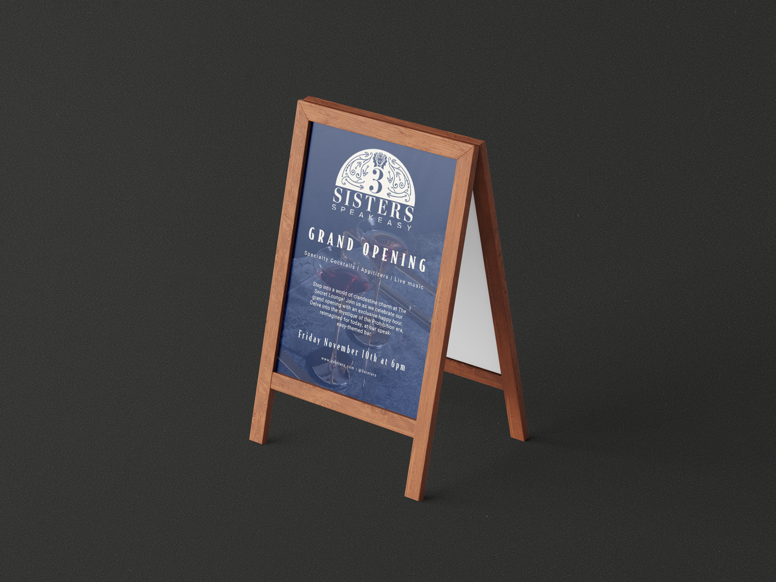
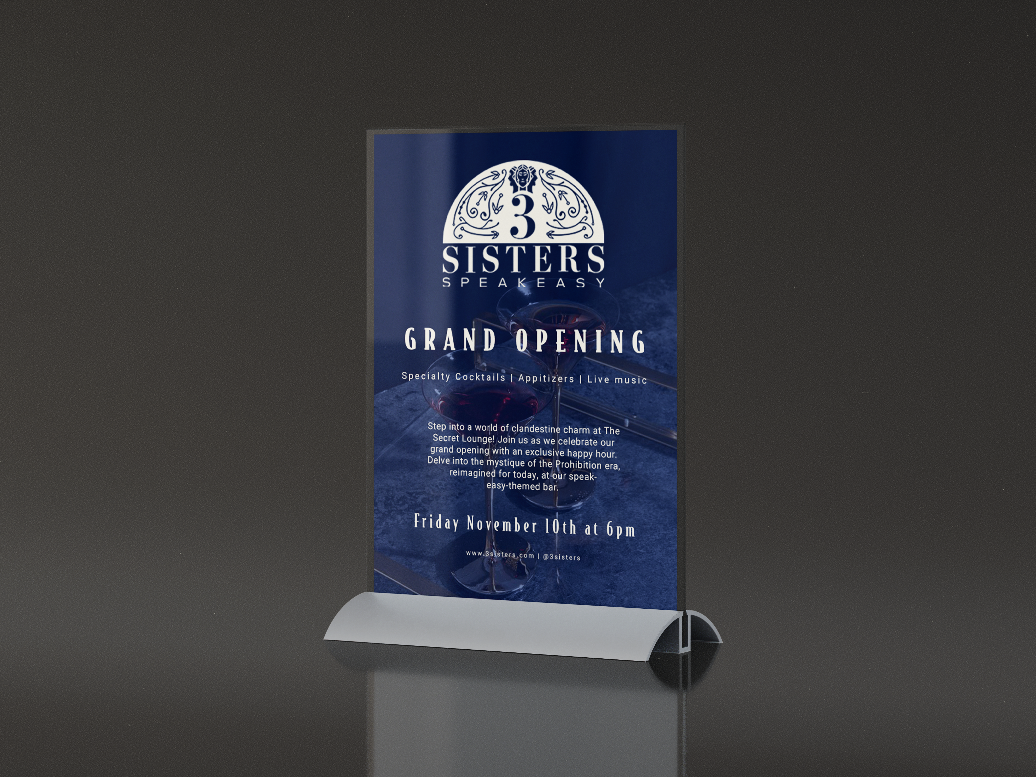
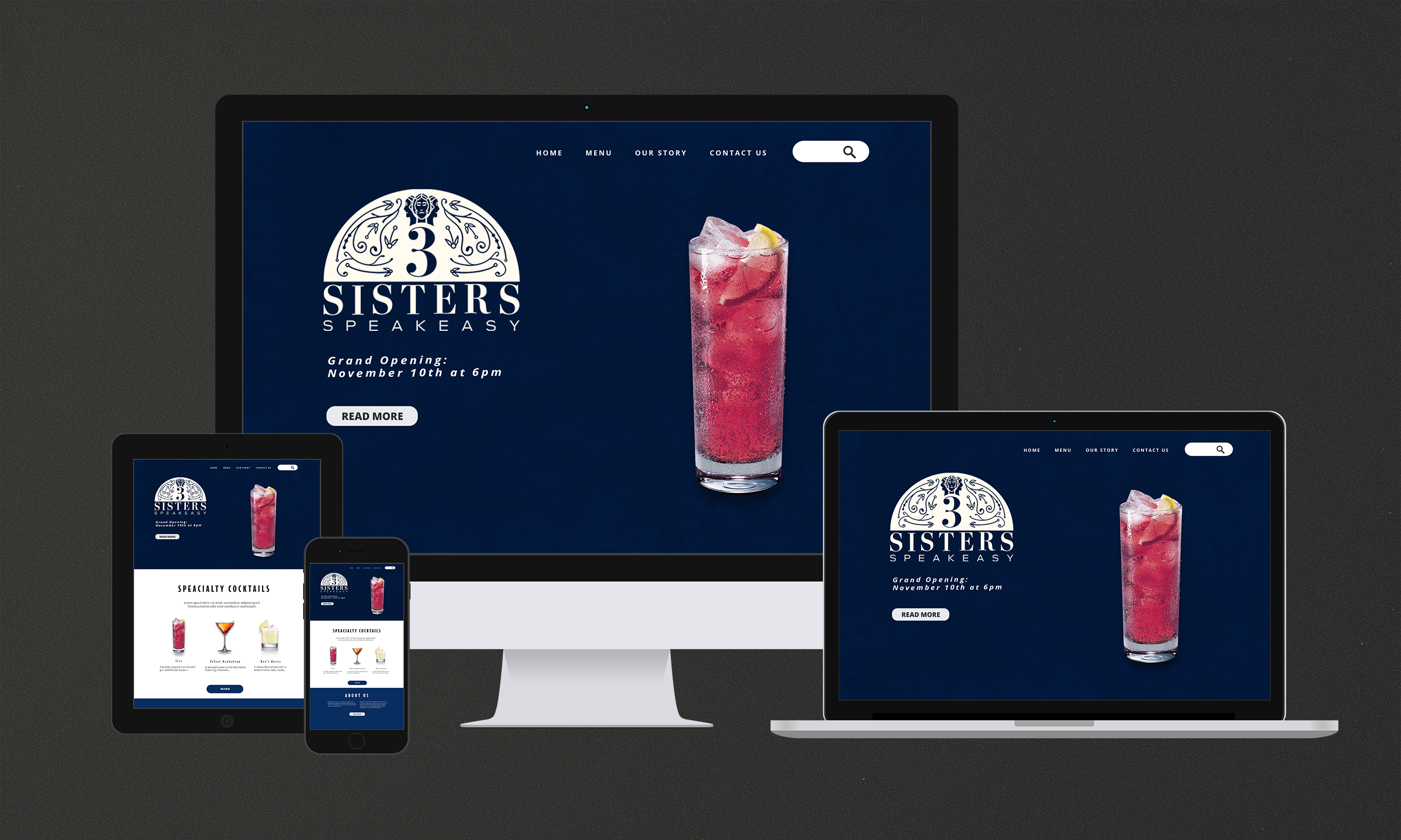
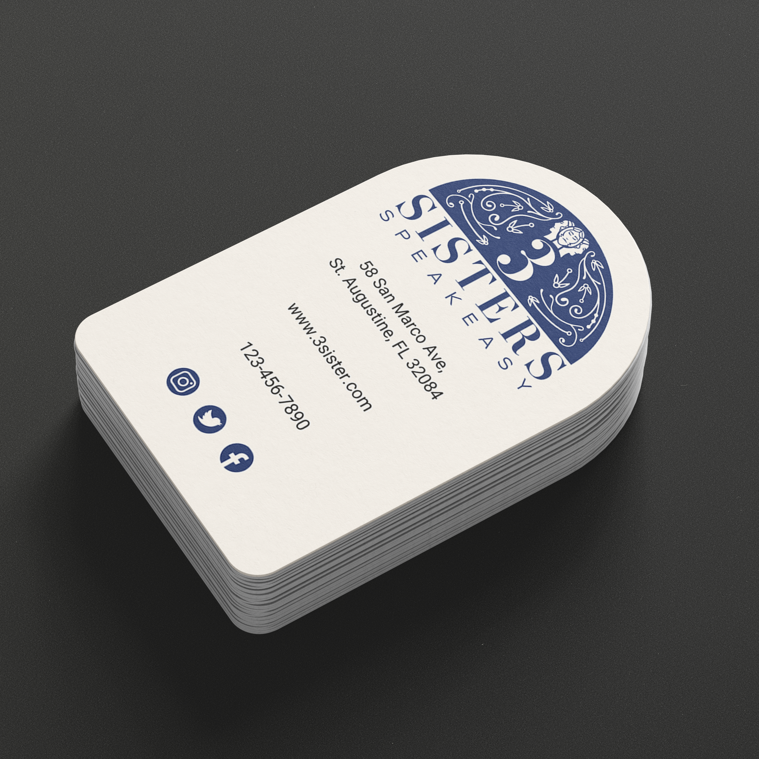
The rebranding leaned heavily into the 1920s aesthetic, using art deco- inspired visuals and a storyline of three sisters—Dodie, Ruth, and Fannie—who ran a speakeasy during Prohibition. The logo, featuring illustrations of the sisters, became the cornerstone of the brand identity, setting the tone for the rest of the visual assets. Menus, signage, business cards, and other touchpoints all incorporated ornate, vintage designs to create an immersive, period-specific experience. Every detail was carefully crafted to transport patrons back to the clandestine speakeasy days, making the restaurant not just a dining venue but a part of the larger narrative of the 1920s.
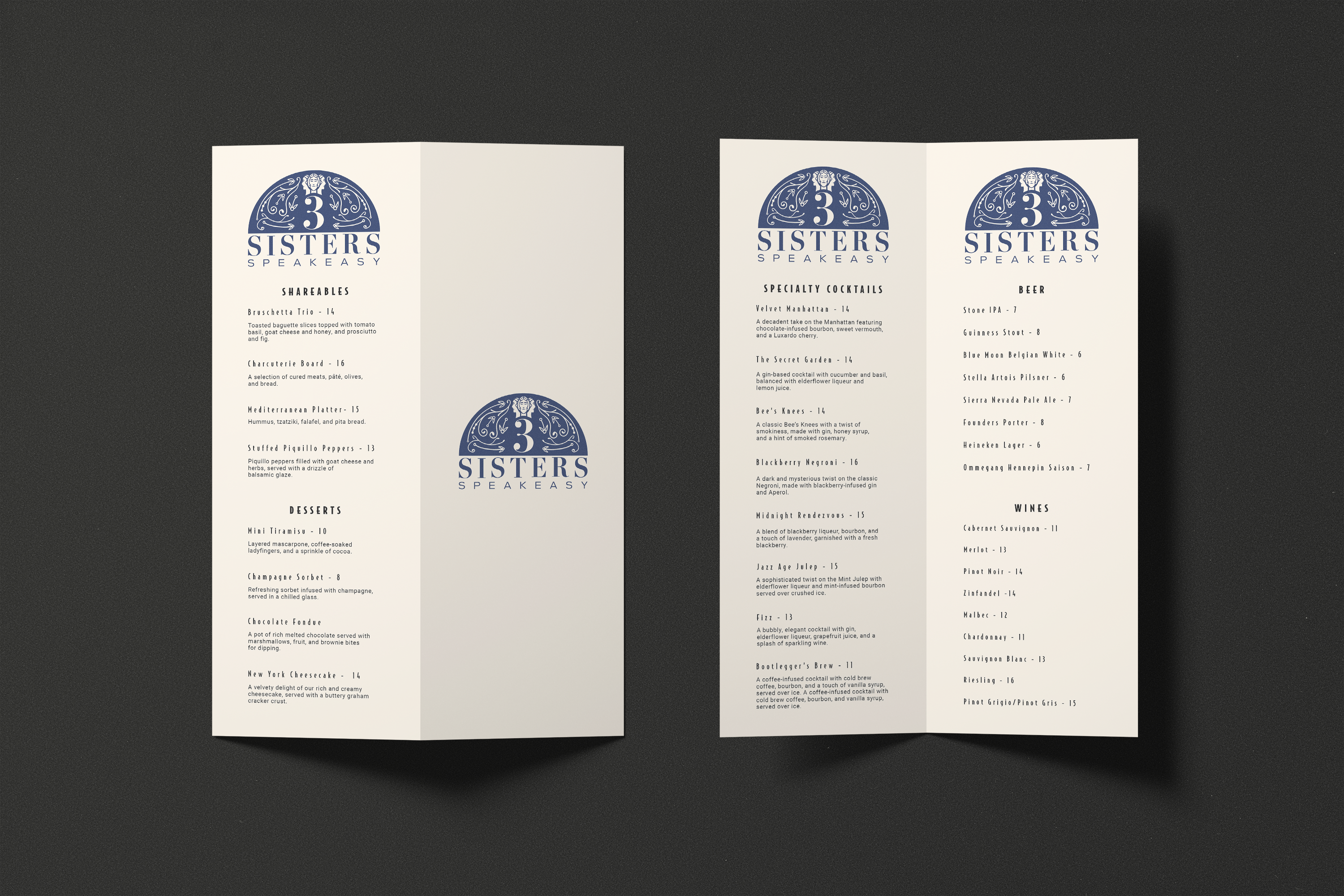
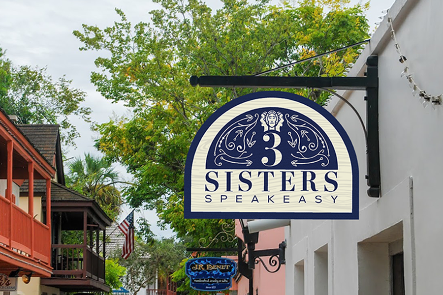
The logo mark draws inspiration from the legend of the three sisters,Dodie, Ruth, and Fannie,who ran a speakeasy during the Prohibition era. Blending this story with classic art deco design, it communicates an elegant, upscale brand identity that seamlessly transports patrons back to the glamour and intrigue of the 1920s.

